

Pastel abstract art has emerged as the ultimate way to bring romance and tranquility into modern living spaces. But how do you incorporate these gentle hues without making your room feel like a nursery? The secret lies in one word: texture.
Why Pastel Palettes are Essential for Romantic Decor
A home should be a refuge. The colors we surround ourselves with directly impact our nervous system. Soft hues like blush pink, dusty lavender, and buttery cream are "low-arousal" colors. They encourage our minds to slow down. When you choose , you aren't just buying a painting; you are investing in an environment that promotes emotional well-being and quiet joy.
The Intersection of Softness and Sophistication
The common mistake with pastel decor is using it on flat, mass-produced surfaces. When pastels are printed on cheap paper, they can look childish. However, when you use high-quality, , the play of light across the physical surface adds an immediate sense of sophistication. The depth of the impasto creates a "shadow" effect that makes the colors look expensive and substantial.
Incorporating Soft Color Palettes in Modern Interiors
Styling Pastel Canvases in the Bedroom
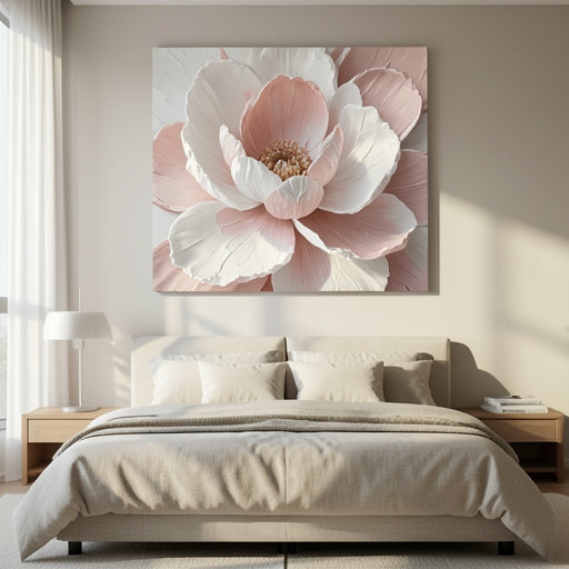
The bedroom is the natural home for pastel art. We recommend placing a large-scale diptych above your headboard. Choose colors that mimic the early morning sky—pale blues mixed with blush pinks. Because the colors are light, they won't compete with your bedding, allowing the art to act as a gentle, dreamy backdrop for your rest.
Balancing Pastels with Minimalist Furniture
If your furniture is structured and modern—perhaps a charcoal sofa or a glass coffee table—a pastel abstract piece acts as the perfect counterbalance. It softens the hard architectural lines of the room. A painting with soft, fluid forms creates a visual "yin and yang," proving that modern decor doesn't have to be cold to be stylish.
The Role of Texture in Pastel Art
Why is texture the "make-or-break" factor for pastel decor? It’s about the light.
Why Texture Saves Pastel Art from Looking Flat
Pastel colors are inherently light and airy. Without physical dimension, they can sometimes wash out against white walls. By using thick 3D paint ridges, Bigbigwall artists ensure that the art has a physical presence. The shadows cast by these ridges provide a "darker" element, giving the painting the visual weight it needs to hold its own in a room with a lot of natural light.
Conclusion: Create Your Dream Sanctuary
You don't need to live in a cottage to embrace a romantic aesthetic. Whether it's the gentle touch of a blush pink canvas or the airy feel of a lavender landscape, pastel art brings a breath of fresh air into any space. It is a style that feels intimate, personal, and endlessly peaceful. Are you ready to soften your walls with a touch of elegance? and enjoy free worldwide shipping on your chosen romantic masterpiece.
Frequently Asked Questions (FAQs)
Can pastel abstract art look modern rather than childish?
Yes! The key is to avoid "candy" colors. Stick to sophisticated, muted pastels—like dusty rose, sage green, or muted ochre—and pair them with clean-lined, modern furniture. Physical texture also helps the art look more like an adult gallery piece.
What is the best wall color to pair with pastel art?